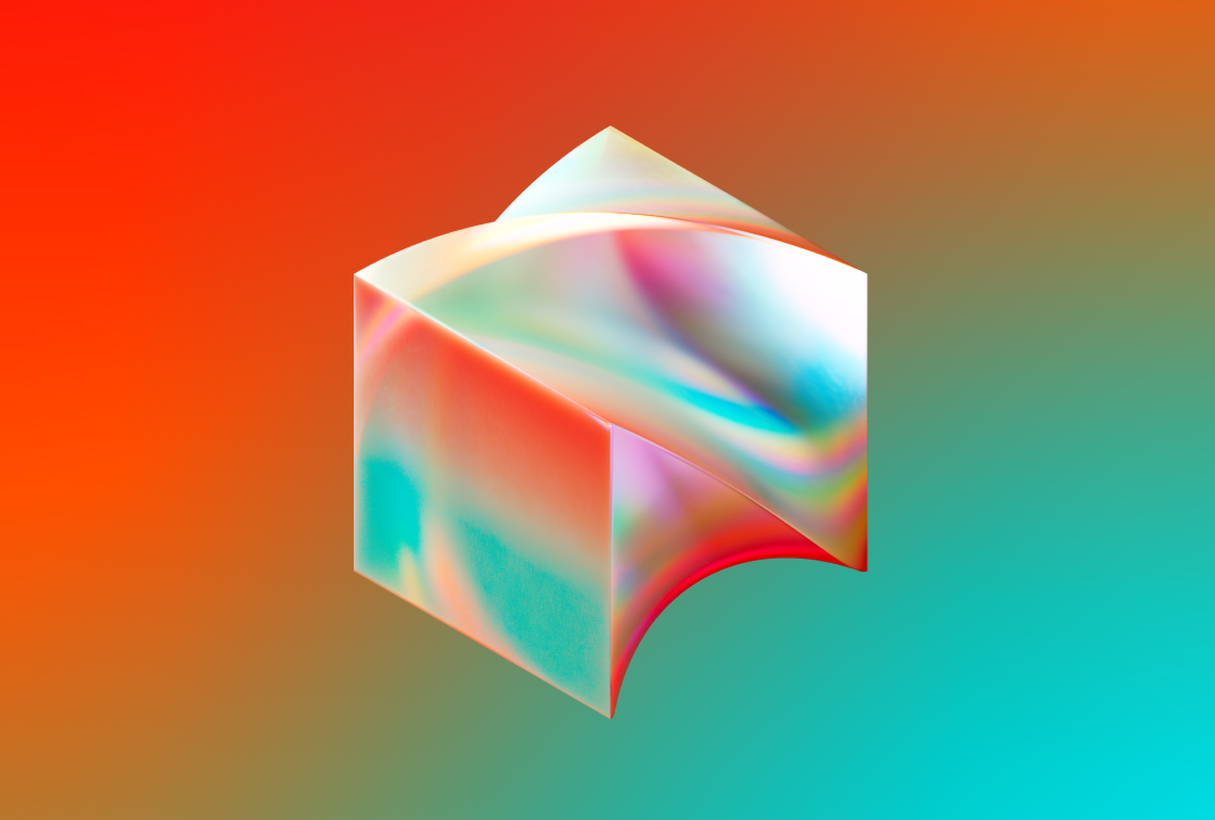
Block
Less than a year into my time at Square, my team was approached to undertake the exciting (and terrifying) task of developing a ‘parent’ brand for Square, and our other business units (which at the time were TIDAL, Cash App, TBD and Spiral). Our team got straight to work, diving deep into identity development work. After countless reviews with our CEO, Jack Dorsey, and a wonderful partnership with Cash App Motion Design Lead, Sekani Solomon, we developed a vision for the brand that was well beyond anything we’d initially imagined.


Block Launch video by Sekani Solomon
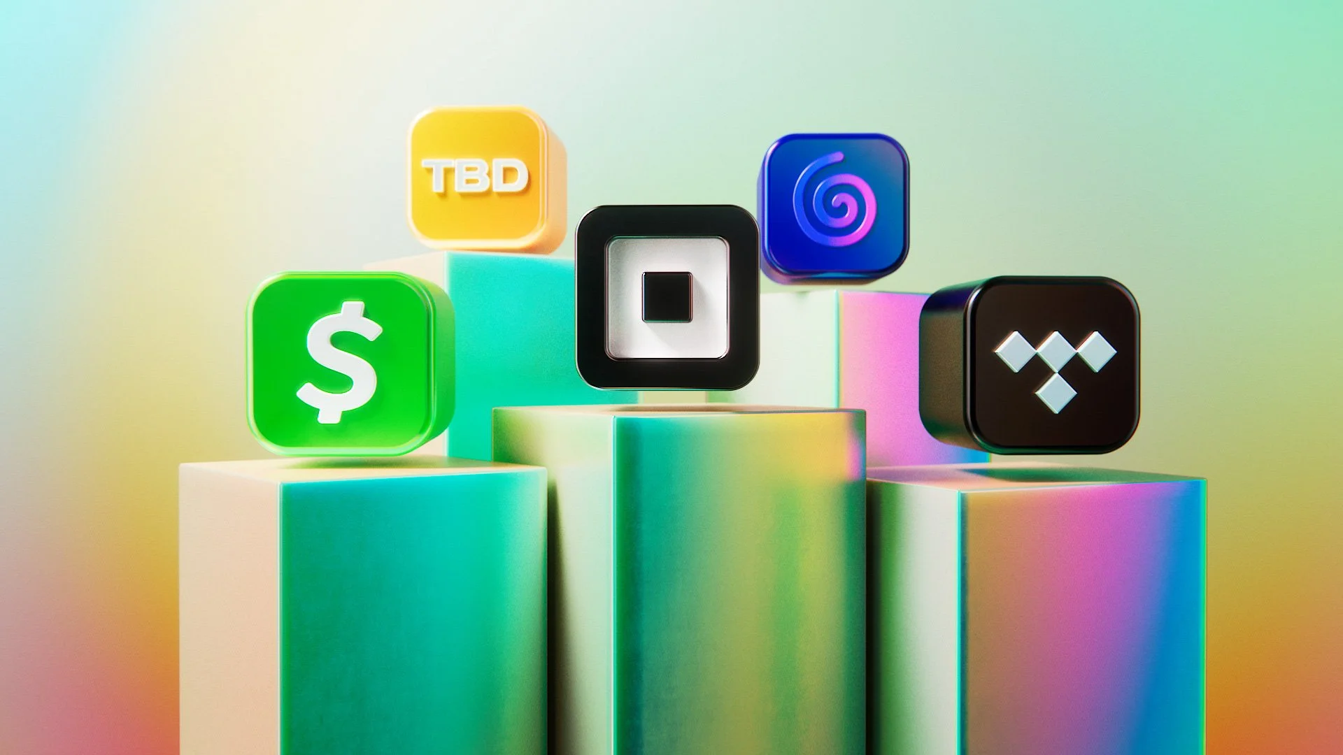
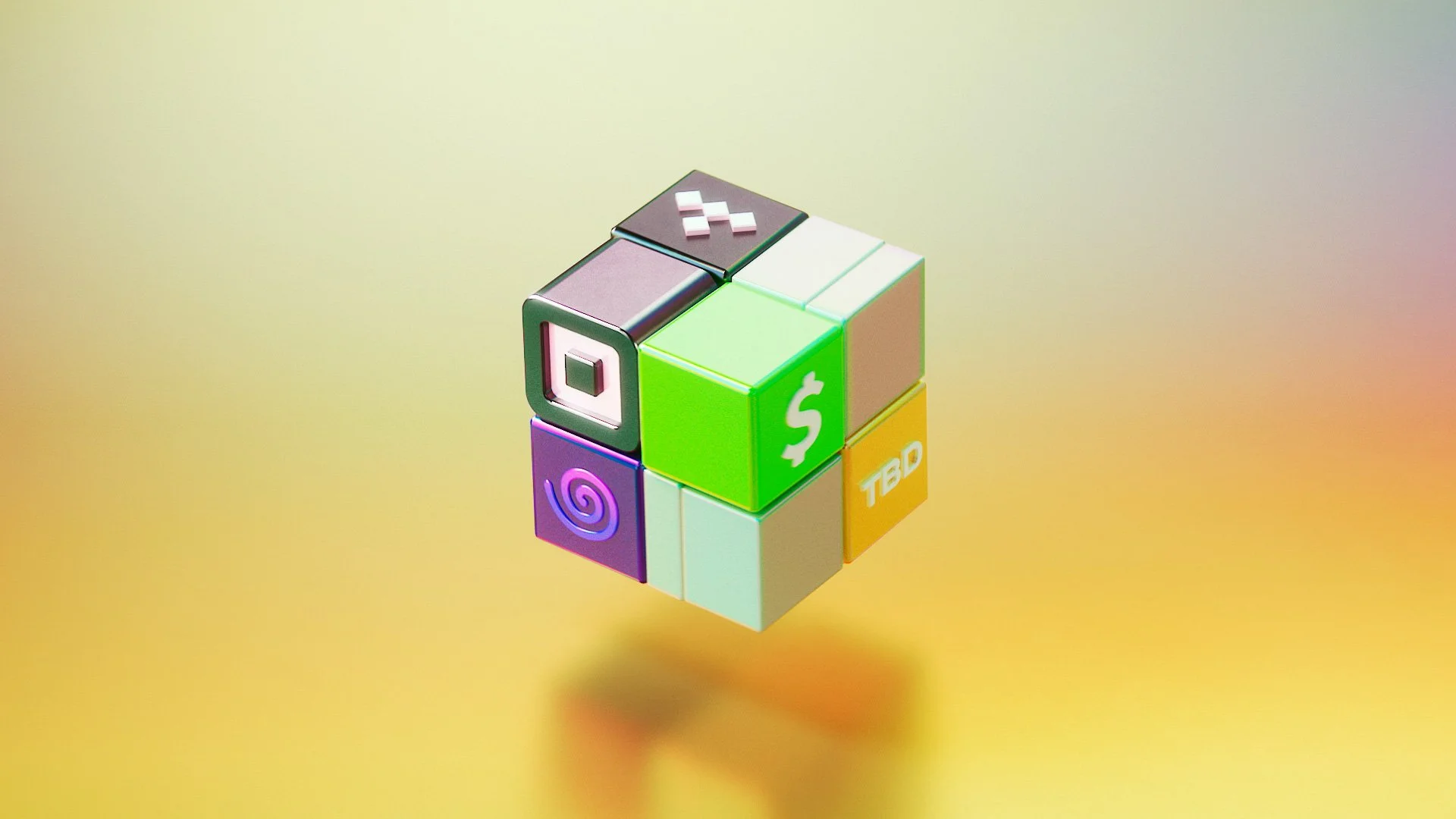
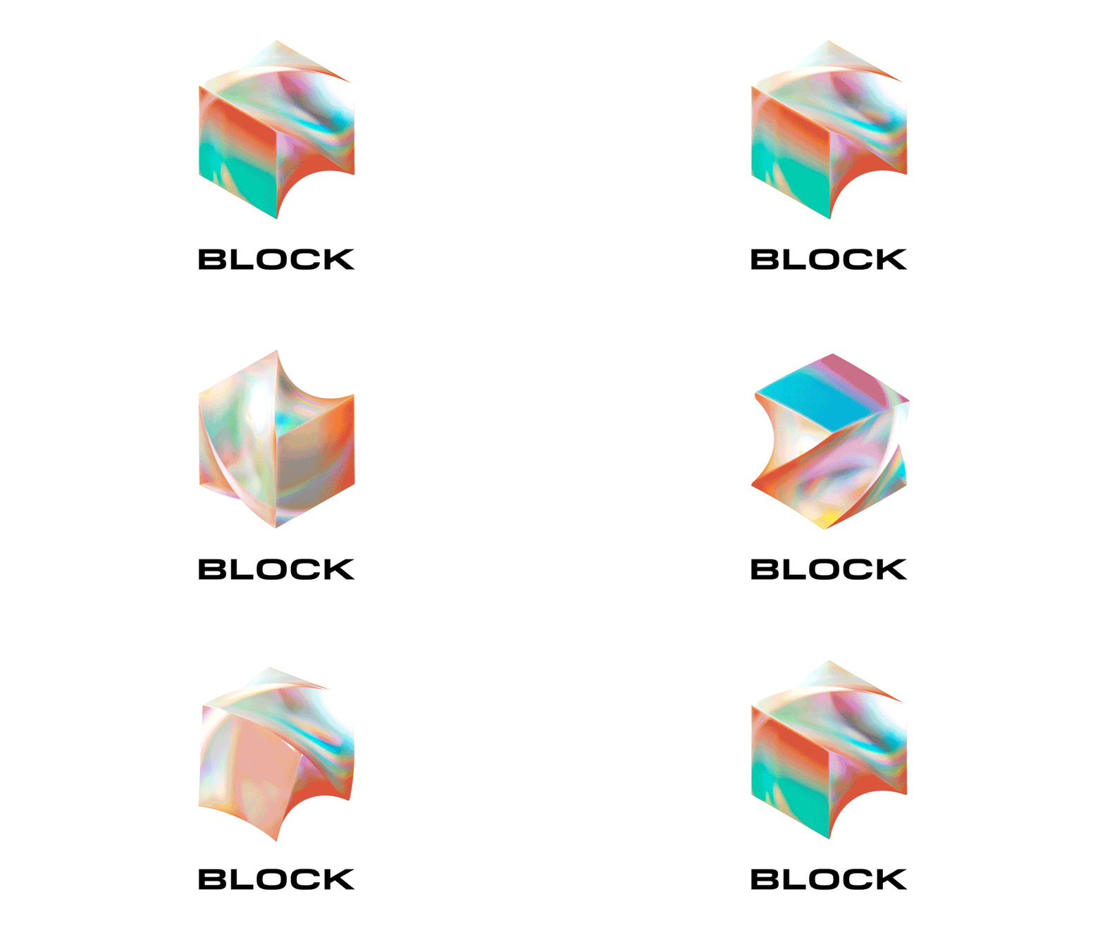
The brand we developed is fluid, art-forward, and ever changing (much like our company). The logo itself speaks to this spirit of evolution and growth, morphing smoothly from a simple geometric block, into a twisted form that reflects its surrounding environment (see it in action on the Block launch site).
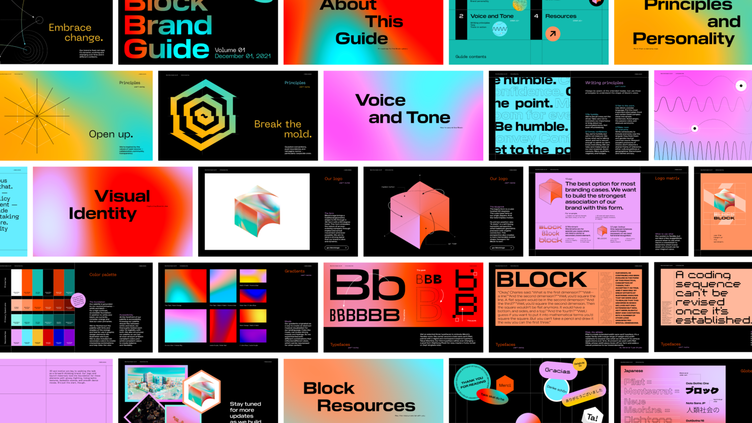
With the flexibility to grow and evolve the brand, we envision all facets of the identity system will shift, depending on context and moment in time. As such, our Brand Guidelines are a constant WIP.
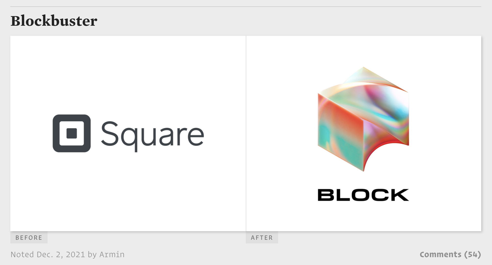
“I think what we are witnessing is the start of the next trend in logo design as other tech companies that look up to a company like Squa… er… Block, try to emulate it.” - Armin Vit, Brand New